All done!
I wrote about our first grade clay dragons in this post. They are all done!


Sixth graders carve erasers with their own abstract design and use them to print individual and group artworks.
Sixth grade is making eraser stamps.
I learned the method from Geninne’s Art Blog. Geninne has a fabulous tutorial on stamp-making including an instructional video. This assignment has two parts….1) create an abstract design stamp and 2) create a stamp based on your initials.
Part 1: Abstract Design
Materials:
I teach this assignment with a packet of handouts…

Explain to students we will be cutting away the white portions of their design…..since they are beginners, the design should be fairly simple. No letters, no words, no numbers!!!!
Here are some sketches…I have to approve their final designs before they cut.


After approval, students transfer design to eraser. Placed traced design ‘dirty side down’ on the eraser and rub with edge of Popsicle stick to transfer.
Carve eraser:
Rules:
Printing:
Time to print! Students could use a stamp pad or color their erasers with watercolor markers (we used Crayola markers). The stamp pad method is quick, but the marker method allows more variety.

Instructions on the board.....
Student Results:

Carved eraser stamps inked with watercolor marker.


6th grade artist thought overlapping colors 'looked 3D'

This student hand-colored her stamp with markers.

Group project with three stamps (hand-colored with markers).


Student hand-inked design inspired by Nike logo and colored negative space with marker.
Many students said this was their favorite project ever!!!! They are clamoring to go on to part 2, a design based on their initials. To be continued!
It is also a special joy for me to see the 6th graders complete the project – I have had about 25% of these kids since they were 5 years old and learning how to write their names.
This printmaking project is also great opportunity to discuss art principles and elements: repetition, unity, and variety. It is appropriate for grades 6-12.

Maybe you have used scratch foam for printmaking in the art room. I’ve seen a lot of beautiful art work using scratch foam and printer’s ink applied with brayers. But did you know scratch foam prints can look like this?

This set of four cupcake prints were all made from the same scratch foam plate during a single 40-minute class.
3rd graders used watercolor marker and scratch foam to create multiple prints. We did an easy directed drawing of a cupcake onto scratch foam, colored the foam with watercolor markers, and then printed the cards onto damp paper.
Materials:
Prep:
Set up a printing station. Fill tub with water depth of 2-3 inches. Set out a folded towel. Tape a sleeve protector to the table. Slide in an alignment sample (see below). Cut a stack of printing papers, enough for each student to make at least 3 prints. Think about drying space (always an issue when printing multiples). Drying rack? Clothes line?
Drawing

Tape sketch on top of scratch foam. Go over lines with dull pencil to incise foam below.
Inking

Color in the scratch foam with watercolor markers.
Printing

Printing station. Students align foam with white rectangle, damp paper with blue rectangle.
http://www.youtube.com/watch?v=sAY0pGj7c7g&rel=0
The third graders were amazed!!!! Vibrant colored cupcakes for their beautiful birthday cards.
ARE YOU READY FOR EVEN MORE FUN?????
Re-inking
Print again!
Students should carefully sign their name on the back of the foam plate WITH PENCIL. Write small.
A word of caution: as always, test this project out yourself before attempting with your students.
1) The degree of dampness of the printing paper is critical. Too dry and the ink won’t transfer to the paper. Too wet and the ink will bleed and blur as the paper dries. For blotting, a fresh beach towel is ideal. My towel was too damp by the third class of the day. I wish I had a couple of fresh dry ones with me. Next year!
2) Size of drawing matters. Tiny drawings the size of a thumbnail just won’t look good.
Day 2: Embellish Prints with Oil Pastels
Students have the option of embellishing their dry prints. These cupcakes are decorated with oil pastel. This is a great way to rescue students less-than-perfect prints. Can you imagine these with a little clear glitter and/or a sequin?


Next we trim our cupcake prints and glue them onto colored construction paper. What fabulous birthday cards for all our family and friends.
Fun – colorful – successful – easy to clean up!
This would be a great Wayne Thiebaud lesson plan – it relates to his dessert paintings in terms of subject matter and repetition.

Wayne Thiebaud. Cakes. 1963
A huge thank you to Carol Catelano Webb, master art teacher, who taught this printing process at a San Diego Art Educators workshop back in 2005.
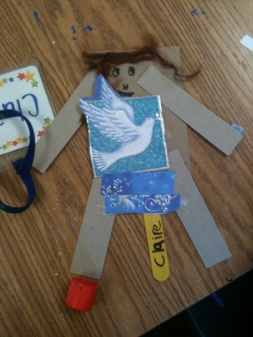
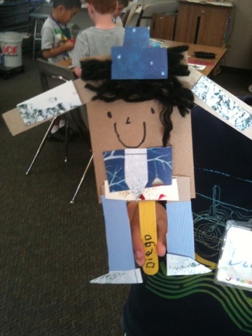
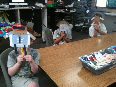
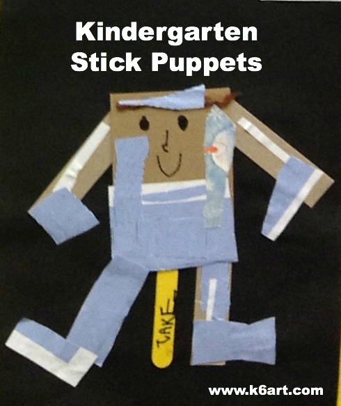 Kinders are making stick puppets. This is their first project using white (Elmer’s) glue, and the whole project is designed to teach gluing skills.
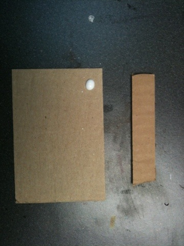
Students first practice opening and closing the (orange) tip of the glue bottle. They learn the bottle is closed when the hard white tip peeks up from the bottle. Then I pass out cardboard.
Take large cardboard and one small cardboard. Put a dot off glue on a corner of the large cardboard, top with the small piece. Press hard to stick pieces together.
We use the ’10 second gluing’ technique. Students press the pieces hard against the table while counting aloud to 10 (is there anything cuter than a class of 5 year olds earnestly counting together?).
We test our gluing by waving the glued pieces in the air while counting to three. Result: 95% hold together. The one or two that come apart provide the opportunity for more glue practice.
We glue on all four cardboard ‘limbs’. Next students write their names on a Popsicle stick and glue it on for a handle. Kids will need to use 2-3 dots of glue and count to 20 to get that stick stuck on.
Add a bit of cut yarn for hair and draw on a face with sharpie.
Cut out paper and glue on to make clothes for puppets. Instruct kids to apply glue stick to both papers they are stick together. This might sound like a waste of glue, but there is a much stronger bond. Don’t want any puppet wardrobe malfunctions!
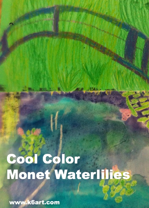
Second grade is studying the cool colors. After watching the excellent elementary color theory DVD Getting to Know Color in Art we looked at photos of Monet’s beautiful garden and pond in Giverny, France. Students could imagine themselves at the pond on a summer day, feeling the willows sway, listening to frogs as they rested on the lily pads, resting in the cool shade, even floating in Monsieur Monet’s ‘art boat’ as it passed under the Japanese bridge.

“Le Bassin aux nymphéas” 1899. One Monet’s many water-lily paintings.
We looked at several of Monet’s waterlily paintings, focusing on his use of cool colors and short, quick strokes of paint. You can download my Powerpoint of Monet’s garden here.
We then created an oil pastel and watercolor art work.
Allow three 40-minute sessions for this project.
Materials:
Discuss Monet’s art, his pond and garden. Review cool colors. View powerpoint or photos of Monet’s garden.
Fold green construction paper ‘hamburger’ (the short way). Glue watercolor paper to lower half of green paper.

Students use oil pastel to draw bridge, water lilies and foliage.
Review painting of pond and Japanese bridge.
Oil Pastel:
Using oil purple and blue oil pastels, draw three arcs (‘rainbows’) for the Japanese bridge. Add some vertical lines to the bridge to finish. Blend and highlight with white oil pastels.
Review photos of water lilies.
Using various green and yellow oil pastels, draw clusters of lily pads on the watercolor paper. The lily pads don’t have to be perfect – just ovals or quick strokes of pastel. They should overlap a bit. Add a few pink lily flowers, highlight with white.
Fill the entire top half of the green paper with foliage in greens and yellow. Use short strokes. Add a downward cascade of short lines for the weeping willow. Tell kids to ‘go behind’ the Japanese bridge.

Use short strokes of oil pastel to completely fill the green paper with foliage.
Painting:
Using the cool colors (blue, green and purple), paint the watercolor paper using long horizontal strokes. Colors can overlap and blend. Go right over the oil pastel lily pads.

Use purple, blue and green watercolors on the lower half of artwork
Students may add a small pinch of Kosher salt to the wet watercolor. The salt absorbs a bit of color and an additional dimension to the pond. Brush off salt when dry.
Wow!!! This project was a hit! We learned about a famous artist, reinforced color theory, experienced the joy of painting on watercolor paper and blending pastels. All kids were very proud of their artwork. Success!
Enjoy!

(Note: post updated 12/22/13)