‘Tie-Dye’ Butterfly

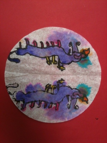
It’s spring! Time for a butterfly art project. How about a lesson that delivers perfect symmetry, color and fun in only one 40-minute session?

Materials:

  • round (basket) coffee filter paper, white (available at the dollar store)
  • Sharpies
  • watercolor markers (we used Crayolas)
  • pencils
  • spray bottle of water

Instructions:

  1. flatten coffee filter
  2. fold filter in half.
  3. use sharpie to draw 1/2 a butterfly on the folded paper.
  4. Trace over all the Sharpie lines again (this helps transfer ink to the other half of the filter paper).
  5. Open the paper. 
  6. Retrace all the faint lines with Sharpie.
  7. Re-fold the paper into its original position.
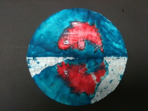
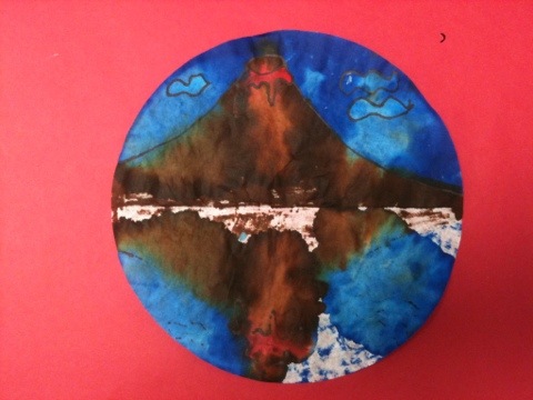
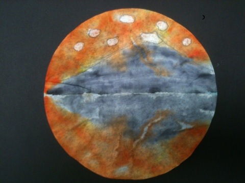
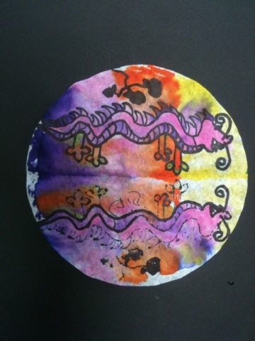
  8. Color the folded paper using watercolor markers. We used warm and neutral colors for the butterfly, and cool colors for a band around the edge of the paper.
  9. Place folded filter paper on drying rack, colored side facing up.
  10. Spray with water. I try to saturate the paper (note: put some newspaper on the floor under your drying rack to catch the colored drips).
  11. Let dry before removing from rack.

I love the faux tie-dye effect created by the diffused color. I also love the round format. Bonus: coffee filters are available at the dollar store! So this project costs a couple of cents.

Second graders use Sharpie and crayola marker to make symmetric butterflies. Allow one 40 minute session.

Inspiration for the Sharpie/coffee filter/watercolor marker method goes to Kati Oetken at ARTASTIC!

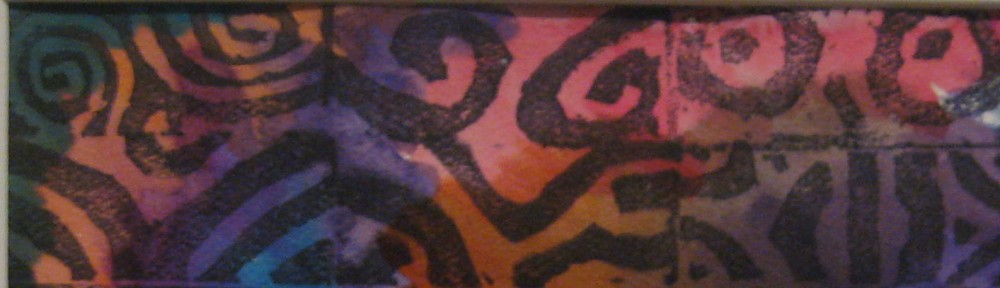
More coffee filter art experiments on this post.

Japanese Design Surprise

Don’t you just love a beautiful surprise? The third grade made Japanese fans from this post on ARTASTIC! . So much fun! After they dried, I opened the folded paper and discovered these:

20120412-164051.jpg

20120412-164232.jpg

20120412-164248.jpg

20120412-164302.jpg

20120412-164331.jpg

This happy accident occurred because the students
1) completely colored 1/2 the round with watercolor marker
2) probably sprayed a lot of water on the folded filter paper (I let the kids spray their own papers. Not only that – I had a 3rd grader supervise the spraying process!)
3) used white crayon selectively as a resist for clouds, snow and fish scales
4) used new (wet!) sharpies for the black lines

I’m thinking symmetry or reflection project for next year.

Check out all the instructions on Kati Oetken’s ARTASTIC! Blog.

Have you had a beautiful surprise result? Do tell!

Chalk Pastel Stencils – Quick, Easy and Beautiful

5th graders used chalk pastels and cut paper stencils to make overlapping hearts.

These beautiful chalk pastel stencils take only one 40 minute session!

Materials:

  • Chalk Pastels
  • Stiff brush (we use our old tempera brushes)
  • scissors
  • construction paper for background (we used white 9″x12″)
  • construction paper cut approx. 4″x6″ for making stencils
  • optional: ready-made stencils

Instructions:

Fold the small rectangle in half. Draw a half heart on the fold and cut out.

Students can use both the positive and negative shapes from homemade stencils.


Color around the edges of the cut out 'window'.


Now take the stiff brush and brush the colored pastel into the stencil ‘window’.

These pink hearts 'stencils' were made on the school die-cut machine.


Lift up the stencil. Students will ooh and aah if they have never tried this process before! Now shift the stencil and repeat the process.  Encourage students to overlap.

Now take the positive shape and color the edge with pastel. Place on the background paper, and brush the color outward onto the paper.

Positive shape can be used as a stencil.


Nice composition and color.


We reused our die-cut stencils for three classes. We just colored and colored again around the edges. Tell the students to relax – it’s going to look beautiful.

Students can also color the background.


Another stencil made on the school die-cut machine.

This student used his stencils to make a bird.

This method would be very interesting with cut paper snowflakes or doilies.

Experiment with doilies.

Try a homemade snowflake stencil.


Minimize the mess: ask students to tap their excess chalk pastel dust onto a piece of newspaper.

What to do with all those used colorful stencils? Try this used stencil collage project. Double the art fun!

This method came from the San Diego Museum of Art  2010 Educator’s Art Fair. The lesson can easily be adapted for all grades K-6.

Paul Klee Painted Desert for Third Grade

3rd graders stamped a line landscape with black acrylic paint, then painted with pan watercolors. Allow two 40-minute sessions.

Do you want a landscape lesson plan that delivers gorgeous art with 100% success in only two 40-minute sessions? Try the Paul Klee lesson featured in the book Dynamic Art Projects for Children by Denise M. Logan. Students spent their first class using black acrylic paint and small pieces of mat board to stamp a jagged landscape. They painted with watercolors during the second class. Here are the results:

Dynamic Art Projects for Children is a fabulous book with many colorful, engaging lesson plans for kids in grades 1-6.  I wrote about the book’s Kuna mola lesson plan in this post.

Can you recommend a book with awesome lesson plans?  Leave a comment!


Eraser Stamps for Sixth Grade: Abstract Design

Sixth graders carve erasers with their own abstract design and use them to print individual and group artworks.

Sixth grade is making eraser stamps.

I learned the method from Geninne’s Art Blog. Geninne has a fabulous tutorial on stamp-making including an instructional video. This assignment has two parts….1) create an abstract design stamp and 2) create a stamp based on your initials.

Part 1: Abstract Design

Materials:

  • Magic Rub vinyl erasers
  • Pencils
  • Paper (copy paper is fine)
  • Tracing paper
  • Popsicle stick or ruler
  • Lino cutter (student grade – we used the ones from this Soft Kut class pack)
  • Stamp pads
  • Watercolor markers (we used Crayola)

I teach this assignment with a packet of handouts…

Explain to students we will be cutting away the white portions of their design…..since they are beginners, the design should be fairly simple. No letters, no words, no numbers!!!!

Here are some sketches…I have to approve their final designs before they cut.

After approval, students transfer design to eraser. Placed traced design ‘dirty side down’ on the eraser and rub with edge of Popsicle stick to transfer.

Carve eraser:

Rules:

  • Stay seated.
  • Keep eraser flat on the table.
  • Grip cutter as if it was a pencil.
  • Make shallow cuts, not deep.
  • Your cutting hand should stay low, close to the table. Your wrist can go up about an inch above the table.
  • Direct cuts away from your body.
  • Rotate eraser so that cuts are directed away from your hand.
  • Cut away white portions of design.

Printing:

Time to print! Students could use a stamp pad or color their erasers with watercolor markers (we used Crayola markers). The stamp pad method is quick, but the marker method allows more variety.

Instructions on the board.....

Student Results:

Carved eraser stamps inked with watercolor marker.

6th grade artist thought overlapping colors 'looked 3D'

This student hand-colored her stamp with markers.

Group project with three stamps (hand-colored with markers).

Student hand-inked design inspired by Nike logo and colored negative space with marker.

Many students said this was their favorite project ever!!!! They are clamoring to go on to part 2, a design based on their initials. To be continued!

It is also a special joy for me to see the 6th graders complete the project – I have had about 25% of these kids since they were 5 years old and learning how to write their names.

This printmaking project is also great opportunity to discuss art principles and elements: repetition, unity, and variety. It is appropriate for grades 6-12.

Related Posts Plugin for WordPress, Blogger...