More Photos from Art Show 2014

Here are some more photos from Art Show 2014.  Thanks again to Devan, our art show chair (and party planning/layout genius) and all the AMAZING art show and art room volunteers who put this show together.

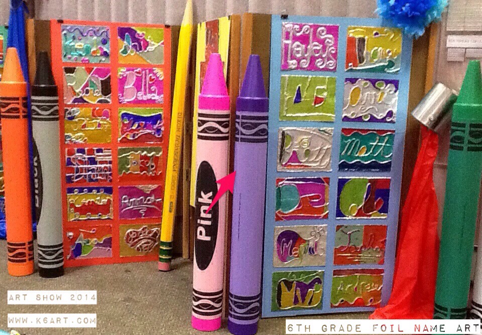
Sixth grade foil name art. Click here for lesson plan

Upper grade display

Foil name art (and those awesome decorations!) in the upper grade area.

Primary grade display

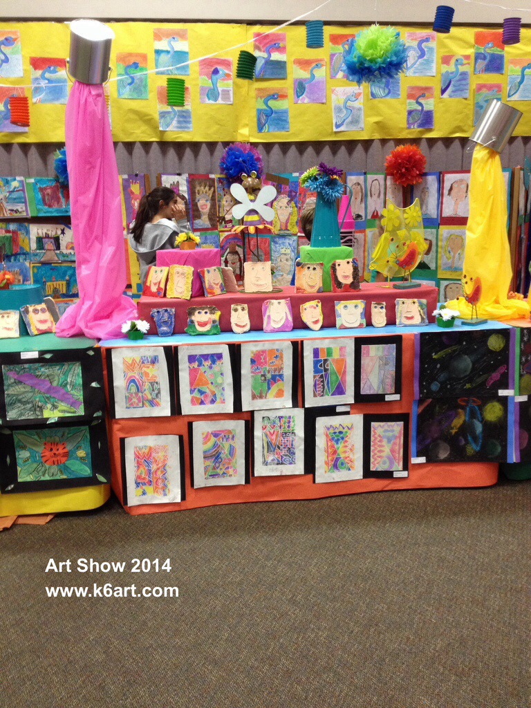
First grade clay self-portraits on table top. Click here for lesson. On skirt: marker and foam prints lesson plan at shine Brite Zamorano. Above on wall: baby oil and oil pastel herons. Click here for lesson.

Marker prints, clay faces and great blue herons in the K-3 area.

Marker prints, clay faces and great blue herons in the K-3 area.

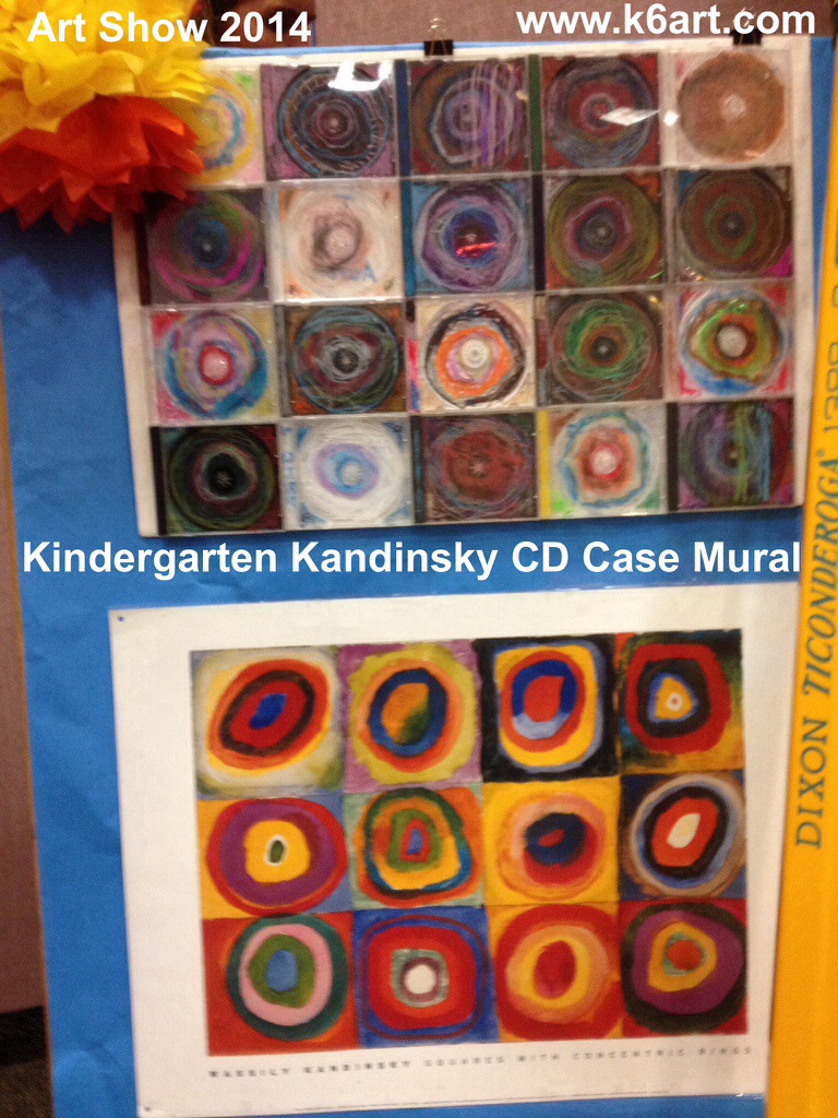
Kindergarten Kandinsky CD Case Circles Mural

Click here for the lesson plan. The lesson went incredibly well. The mural was mounted on foam core using the 3M clear mounting tape.

Primary grade display

Kandinsky CD case circles mural

Shoe Art and Sport Trophies:

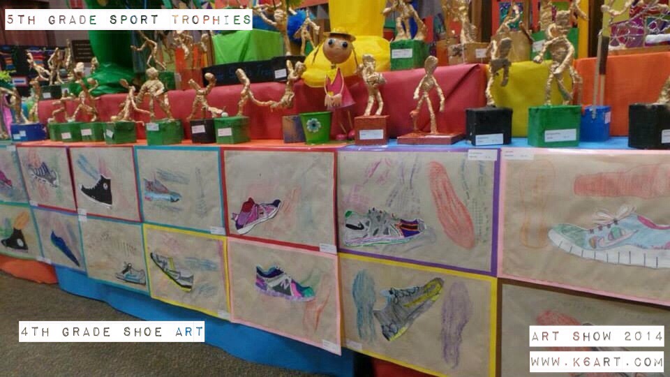
On the table skirt: fourth grade shoe art. Click here for lesson. This is a 100% successful lesson.

Fifth grade sport trophies. Click here for lesson.

Upper grade art display

Shoe art and sport trophies in the upper grade area.

Upper grade display

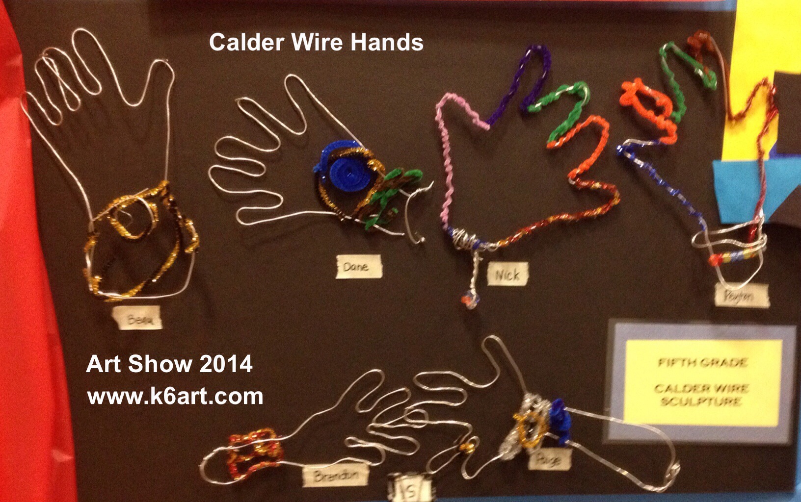
Calder wire hands

Want more pictures? Check out our first post from Art Show 2014. And check out Art Show 2013 and Art Show 2012! Click here for more on Devan’s space-saving displays.

Our volunteers are the best! Our school is blessed to have the help of parents year-round in the art room. We had some amazing, hard-working parents who hung this show in just three days.

It was our last show with Devan as chair. We will really miss her vision and energy. How fortunate we are to have had her help these past four shows.

Enjoy!!!!!

What’s your best tip for a successful art show?


Roy Lichtenstein Art Project for iPad and Computer

Our 6th graders did another digital art project this week: a quick artwork inspired by pop artist Roy Lichtenstein. We used iPads, but the good news is you can do this project from a computer just as easily.

20140501-094320.jpg

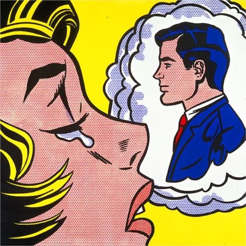
Lichtenstein’s Thinking of Him, 1963.

After looking at Lichtenstein’s 1963 painting Thinking of Him, students used their iPads to do a Google search for Lichtenstein images. They saved their five favorites to the camera roll.
I asked what they noticed about Lichtenstein’s work. Students noticed word bubbles, a lot of blonds and cartoons. I asked them to review their saved images and look for

  • everyday items
  • primary colors (red/yellow/blue)
  • black outlines
  • dots, especially for flesh tone

We talked about appropriation in art. During the 1960s, Lichtenstein and other pop artists such as Andy Warhol used pre-existing images of everyday objects (i.e. comics) as a starting points in their artworks. I passed out enlargements from old newspaper comics, plus the little wax paper primary color comics from Bazooka bubblegum.  I explained that these types of images were well-known back in the early 1960s. Even the dots (known as ‘benday’ dots) Lichtenstein used were appropriated from comic book printing techniques used back in the 1960s.

The digital Art Project
We used the free, online TATE kids dotshop website to create our digital artworks. (note: dotshop is compatible with iPad and computer).

How to create a digital Lichtenstein-inspired portrait using TATE kids DotShop.

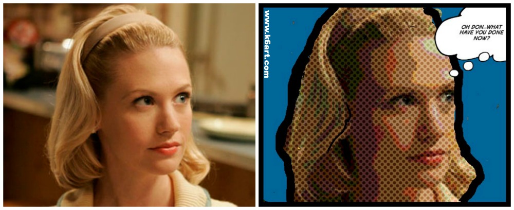
Create a digital Lichtenstein-inspired portrait using TATE kids DotShop. Teacher example. Betty Draper photo via AMC

Steps to create a Lichtenstein-inspired digital artwork:

1.Open TATE Kids

2. a) use the camera option to take a selfie or picture of your friends or b) appropriate a well-known image from the internet (e.g. Betty Draper, Sponge Bob, Arnold Schwartzenegger).

3. Adjust color and benday dot size.

4. Color in the background a solid color

5. optional: outline in black

6. optional: add text.

7 Save within the website, then save to camera roll.

8. Turn in to digital turn in folder on Google Drive (click here to read about how we turn in digital art).

6th grade results 

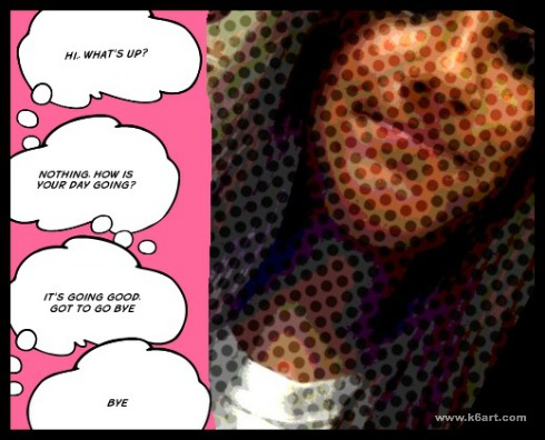
Kenna's appropriated image, includes dots, pink background and text.

Kenna’s appropriated image, includes dots, pink background and text.


Appropriating an image: Lucas found an image of Arnold Schwarzenegger, added benday dots, colored the background red, and added text.

Appropriating an image: Lucas found an image of Arnold Schwarzenegger, added benday dots, colored the background red, and added text.

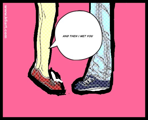
DotShop Lichtenstein-inspired self portrait

Enjoy!


Do you have a favorite Lichtenstein-inspired art project?


iPad Blended Self-Portrait


iPad blended self portrait

Our 6th grade did some quick blended self portraits using their iPads and two free apps: Pic Collage and Sketchbook X. The goal of the lesson was to learn the layers, free transform and opacity tools in Sketchbook X.

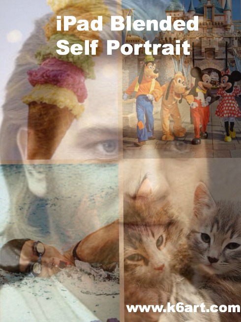
Obi-wan's favorite pet, vacation, activity and food are combined into a layered self portrait.

Obi-wan’s favorite pet, vacation, activity and food are combined into a blended self portrait. Allow one 40-minute class.

Step 1: Pic Collage App: create a photo collage of your favorite things

Students had to find four images representing

  • a pet (or dream pet)
  • favorite vacation (or dream vacation)
  • favorite food and
  • favorite activity or sport

The Pic Collage app allows students to add photos directly from the web without a Google image search. The students arranged them in a grid template, then saved to the iPad camera roll.

Step 2: Sketchbook X App: working with layers and free transform

In Sketchbook X, students created two layers. Layer one was used to shoot a selfie, and layer two was used to import the photo collage from the camera roll. For many students it was necessary to use the free transform tool to resize the photos to fill the screen. .

Step 3: Sketchbook X app: Adjust the opacity to reveal the blended self portrait

Students used the opacity slider in the first layer to reduce opacity and reveal the photo collage layer underneath.

I create a 10 minute video tutorial of the process.

https://www.youtube.com/watch?v=f7U1AbiahXA

Students saved their completed portraits to their camera roll, then turned them in to me electronically via Google drive.  Click here to read about how students turn in digital art.

Notes:

  •  Instead of finding photos on Google image, use students’ personal pet and vacation photos. Students could bring them to class as printed photos, or digitally via Google drive.
  • Want to skip Sketchbook X? Combine your photos with free photo blending apps, such as  iBlendy2 or Photoblend.
  • Video tutorial recorded with the AirServer app for Mac.

Enjoy!

Video Lesson: Flower Fields in One-Point Perspective

flower fields in one point perspective

Spring is here. This month the beautiful Flower Fields in Carlsbad, California burst into bloom.

Flower Fields in Carlsbad, CA. Photo sources: bloomingbulbs.com;

Flower Fields in Carlsbad, CA. Photo sources: bloomingbulbs.com;

The fields are filled with colorful ranunculus flowers. Each spring families throughout San Diego trek to the Flower Fields to admire their beauty. This outing is very popular – a show of hands revealed almost all my 5th and 6th graders had visited the Flower Fields.

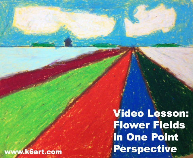
We drew the flower fields in one-point perspective to create an illusion of depth. We used colored 9″x12″ construction paper, rulers, pencils and erasers and oil pastels. In this 13 minute video, I demonstrate drawing the horizon line, vanishing point, and orthogonals to create the illusion of depth.

https://www.youtube.com/watch?v=gJ7NYjGPY0c

Thanks to Hope Knight at Mrs. Knight’s Smartest Artists for this lesson. For similar lessons using markers check out this post on A Faithful Attempt and this post on Kids Artists.

Enjoy!

iPad Symmetric Butterflies

20140318-083501.jpg

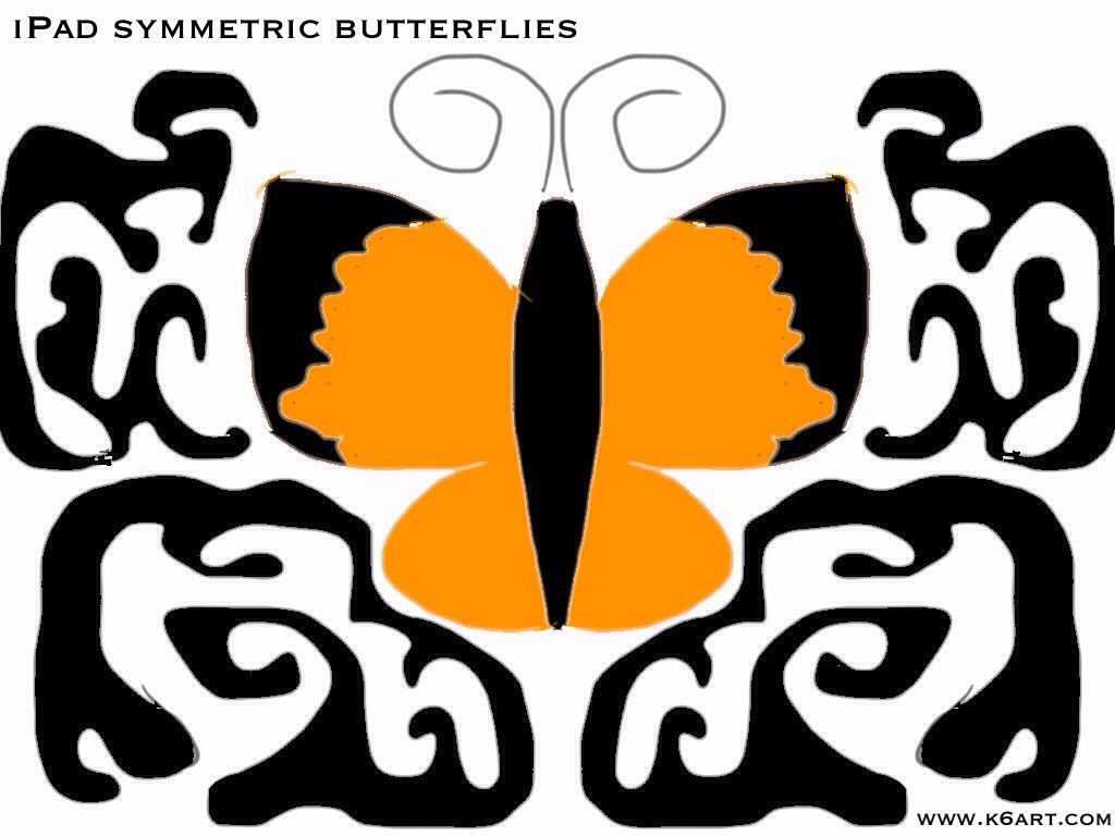
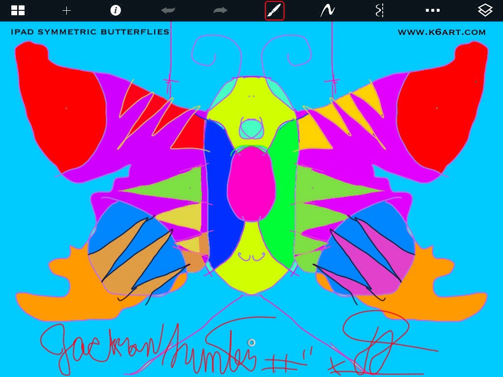
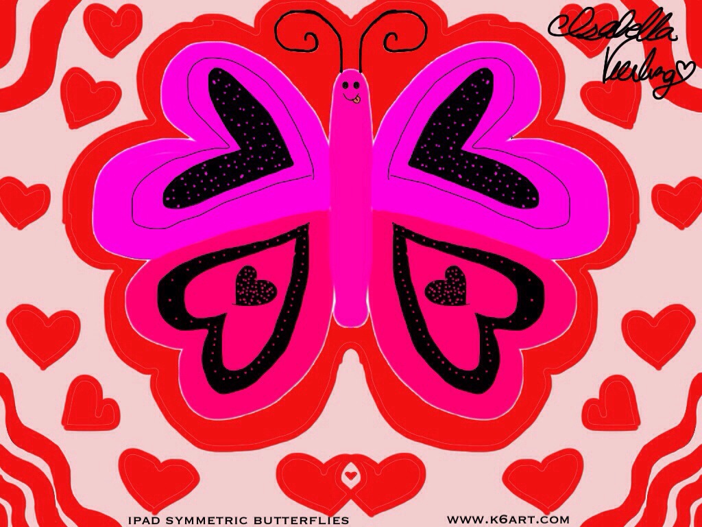
Spring arrives this month. It’s time for a butterfly art project. This year our 6th graders created symmetric butterflies using iPads and the free app Sketchbook X. We are a 1:1 iPad school; students created a butterfly on their own iPad during a single 40 minute class.

We used two basic tools: the symmetric drawing feature and flood fill.

20140318-084455.jpg

Background design

Students had the option of using a colorful background, or of filling the negative space with a design. I love how this student created a background design that echoes the wing design.

Flood Fill to Color Individual Sections

20140318-085636.jpg

Notice how the lines are symmetric but the colors aren’t?

20140318-085119.jpg

Love it!

20140318-090152.jpg

Using Layers For Complex Designs

Finally, here is the butterfly from our most advanced student. This design incorporates the layer tool on Sketchbook X. I’m going to ask this student to guide the class through a layer tool lesson at our next iPad art session.

Use Shared ‘Turn in’ Folder on Google Drive to Collect Student Work

Our sixth graders use Google drive in their general Ed classrooms and are familiar with it. Here are the steps we used to turn in digital art:

1. I set up a ‘turn in art’ folder for each sixth grade class.
2. I shared it with each student in the class. To do this, I had to individually enter each student’s school email address. I walked around the class with my iPad and had each student type in their own address. This took less than a minute per student, and I did it while they worked.
3. The students saved their butterflies to their camera rolls.
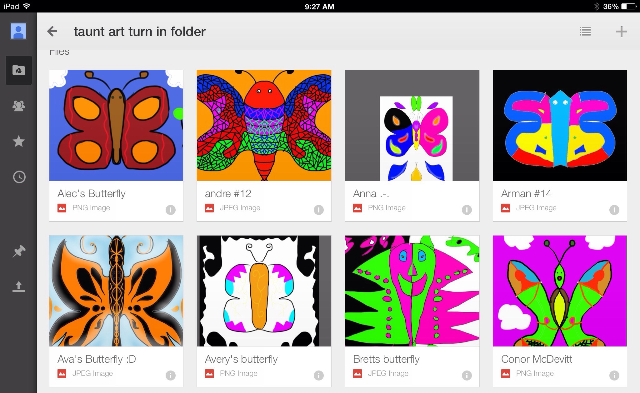
4. The students opened google drive and uploaded their butterflies to the shared folder. They had to rename the photo with their first names.

Here’s what the turn in folder looked like at the end of class

20140318-092913.jpg

Don’t be Afraid

Check out Sketchbook X tutorials on YouTube. Ask students for help ahead of time – I did! My students are ‘digital natives’ – they mastered the whole process better than I did. In fact, our school has a ‘genius bar’ staffed by tech savvy sixth graders.

Here is a basic Sketchbook X tutorial for the art room from Tricia Fuglestad.

Enjoy!

Related Posts Plugin for WordPress, Blogger...